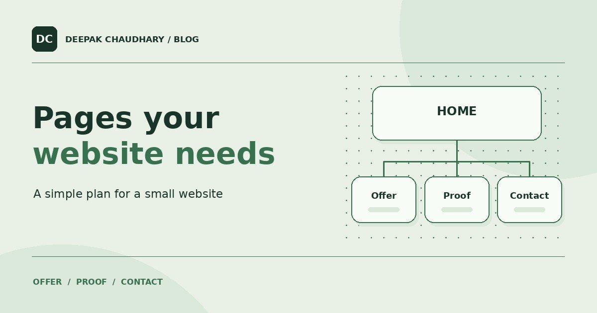
Write down what a visitor needs to decide before they contact you or buy. A local repair shop needs to show what it repairs, where it works and how to book. An online tool needs to show what it produces, what it costs and what happens after someone pays. Let those questions decide the pages.
A short site can do this well. Give each page a job, then decide which jobs can share a page. A single service with a simple booking process may fit comfortably on a homepage with a contact section.
Start with the pages that help someone act
Scroll the table sideways on a narrow screen.
| Page or section | Visitor’s question | What to include |
|---|---|---|
| Home | Am I in the right place? | What you offer, who it helps, where you serve and one clear next step. |
| Services or product | Will this do what I need? | What is included, who it is for, practical limits and pricing or the quote process. |
| Work examples or demo | What will I get? | A real example or a clearly labelled demo with enough detail to understand the outcome. |
| Contact and support | How do I reach you? | The channel you monitor, useful hours where relevant and how an existing customer can get help. |
| Policies | How will my details and order be handled? | Accessible privacy, payment, cancellation or refund information where relevant to how you operate. |
Put answers close to the decision. If a product costs ₹99, show the price before asking for personal details or taking the visitor to checkout. If you quote each job separately, say what you need to prepare a quote and when you normally reply.
For a local service, make the contact path short
Imagine a bicycle repair shop. Its homepage can explain that it handles punctures, brake adjustments and routine servicing. The service section can explain which jobs need an appointment. The contact page can provide the address, hours and an easy way to ask whether the shop can take a particular repair.
Proof can be simple. A before-and-after example with permission, a photo of the workspace or a short account of a repair gives the visitor something concrete to assess. If the same person will maintain every page, choose a format they can update when a price or opening time changes.
For an online tool, show the output before the form
SurpriseLinks creates personalised gift pages. A visitor can open a fictional demo and see what a recipient will get before starting an order. The creation form is for the person who has decided to make one. The help and recovery paths serve someone who already placed an order. These are different jobs, so each has a clear place. SurpriseLinks anniversary demo · How it works.
For your own tool, plan the returning customer’s path as early as the purchase path. Someone may close the browser after paying or open your site on a second device. Make it easy to find the order, learn its status and contact support.
Add pages when they answer a separate question
An About page earns its place when the story, qualifications or approach matter to the decision. An FAQ earns its place when people repeatedly ask the same questions and those answers are hard to find. A blog is useful when you can write guides that solve specific problems your customers have.
Start by making the essential path easy to follow. Then decide who will update the information and how often. If the owner needs to edit content regularly, that requirement should shape the choice of technology. PHP or WordPress for a small website.
Check the plan with one reader
Ask someone unfamiliar with the business to open the site on their phone. Give them a task such as finding the price, opening a sample or booking a call. Watch where they pause. If an essential answer takes too many taps, move it nearer the point where the person needs it.
Once the path makes sense, check the site’s links, mobile layout and public pages before sharing it widely. A 15-minute website health check.